The digital identity of a brand is the way in which it wants to be perceived by its audience. In the social media, it is essential to respect the characteristic aspects of a brand, always alluding to its traits and making the brand recognisable in the same way.
Therefore, the brand not only has its own visual characteristics (a logo, a colour, a font, and its own claimThe claim is the phrase that speaks of the excellence or qualities of a product within the context of an advertising campaign to promote the product or service. It is confused with the slogan, but the difference is that the slogan defines the brand itself, its philosophy or “way of being” while the claim speaks of the qualities of a service or product. Examples:: Slogan: A memorable example is Nike’s hallmark phrase: Just do it. Claim: The one made by Fairy in its initial campaigns: The anti-grease miracle.), but it also has a voice and its own language and particular style of communication. This voice tries to portray the organisation, respecting its mission, vision and values.
Voice
The voice of Manusa is feminine, responsible, approachable and technical, and it skilfully and responsibly handles the jargon of the sector, translating it and making it understandable to society. It treats users informally yet politely, respectfully, sensibly, sensitively and decisively. The voice of Manusa is neither jocular nor inconsiderate.
The voice of Manusa is also an expert voice, which seeks to add value to the community, sharing knowledge in a disinterested manner, and contributing towards social progress and the transfer of knowledge among people. It is a voice that is concerned about the world around it, and its services and products have a positive social impact on both a social and environmental level.
The voice of Manusa is sensitive to its surroundings, and its impact is constructive in purpose, always attending to those who start a conversation. It is a resolute, courageous voice, capable of solving conflicts and facing problems.
In addition, the voice of Manusa is inclusive, diverse, sustainable and global.
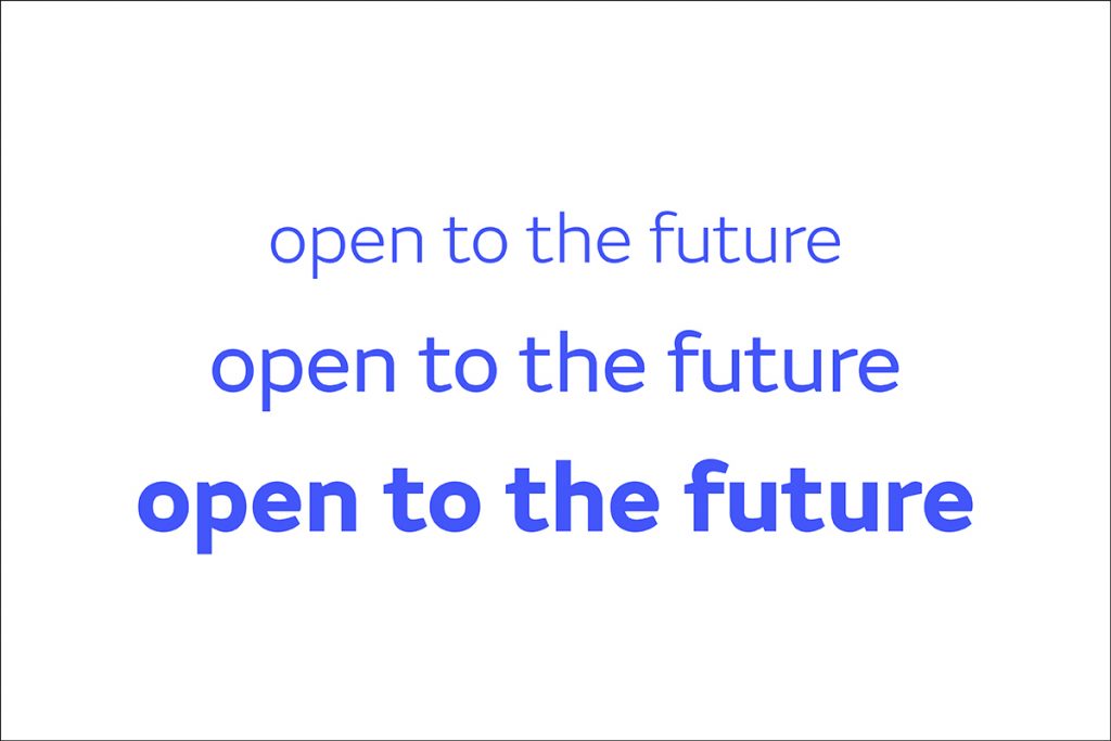
The language used by Manusa is expert and specific to the sector, yet it always seeks to translate it into a universal context that can be understood by everyone. It respects the sector’s own nomenclatures, alludes to terminology accepted by its communities, and uses technical terms if necessary.
Logo
This is the version of the Manusa brand. Composed of the name, the symbol and the tagline. This logo structure is considered the main expression of the brand.
This is the version for a international distributor of the Manusa brand. Composed of the brand name, a symbol, the tagline and the description, this logo structure is considered the main expression of the brand for official international distributors.
Font
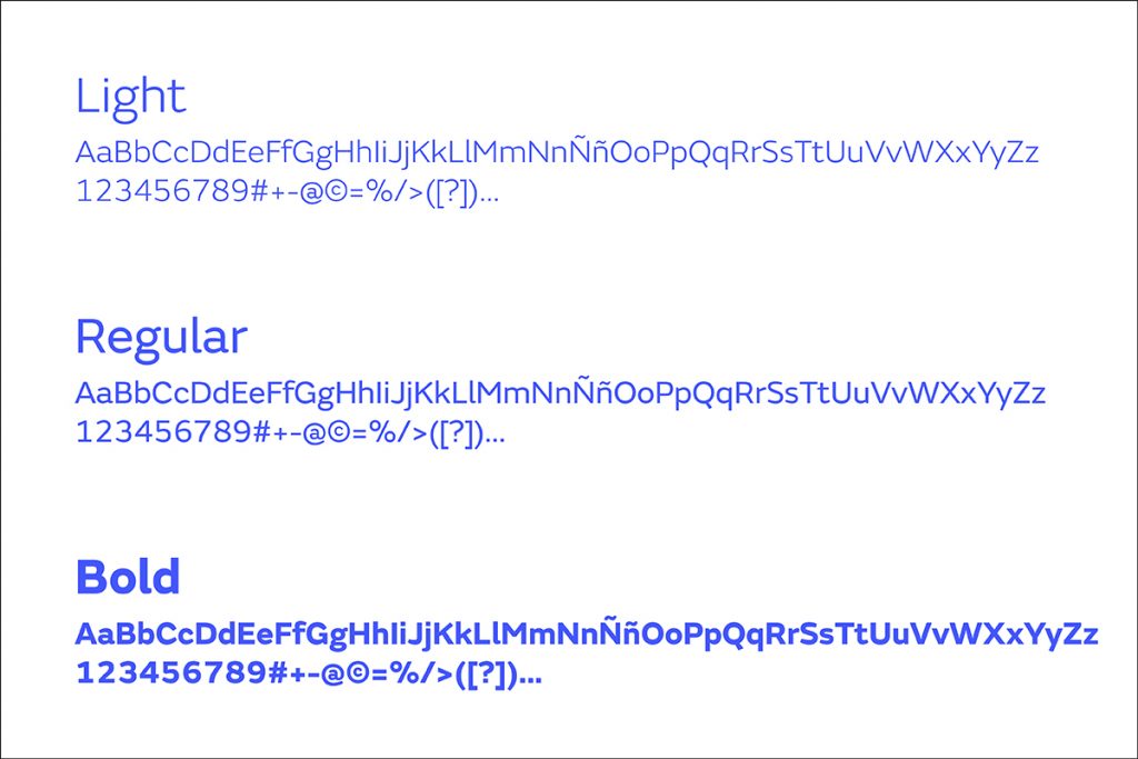
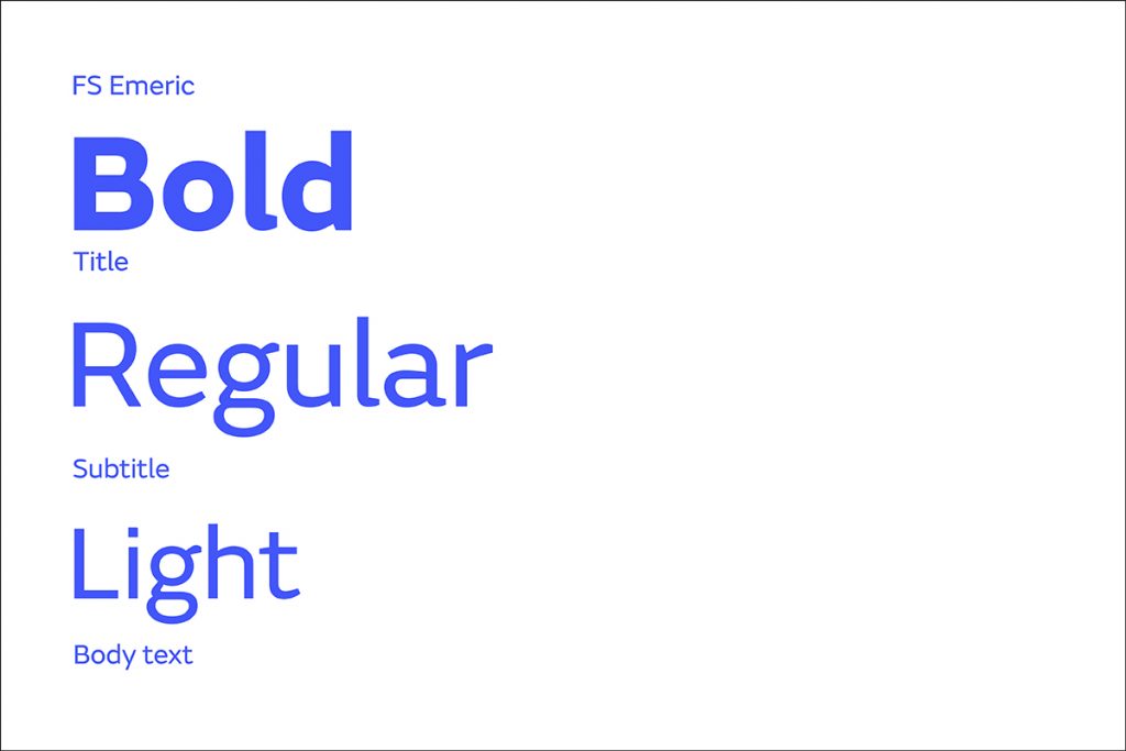
“FS Emeric”font is used in light, regular and bold to create a common corporative code.
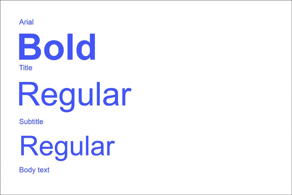
If there are difficulties in using “FS Emeric”, the Arial font in regular and bold will be used.
Use
It is important to respect the uses, as this provides clarity, uniformity and consistency in communications.
Font hierarchy
The distinction between the different font styles will help prioritise the information and will enable readers to identify the most important aspects of the content.
Bold: This style is used for titles. Titles should be a summary of the most relevant information and should be constructed in an attractive way to attract the reader’s attention.
Regular: For subheadings, quotes, infographics and other small blocks of text that add information. These elements highlight specific aspects of the information, and help readers detect important parts of the content.
Light: The body of information will be where most of the explanation is found. It stands out less than the previous two, so it must be large enough to be completely legible by all users.
Colours
The colour of the Manusa brand is blue.
RGB: 66 / 86 / 249
HTML: #4256F9
Photographs
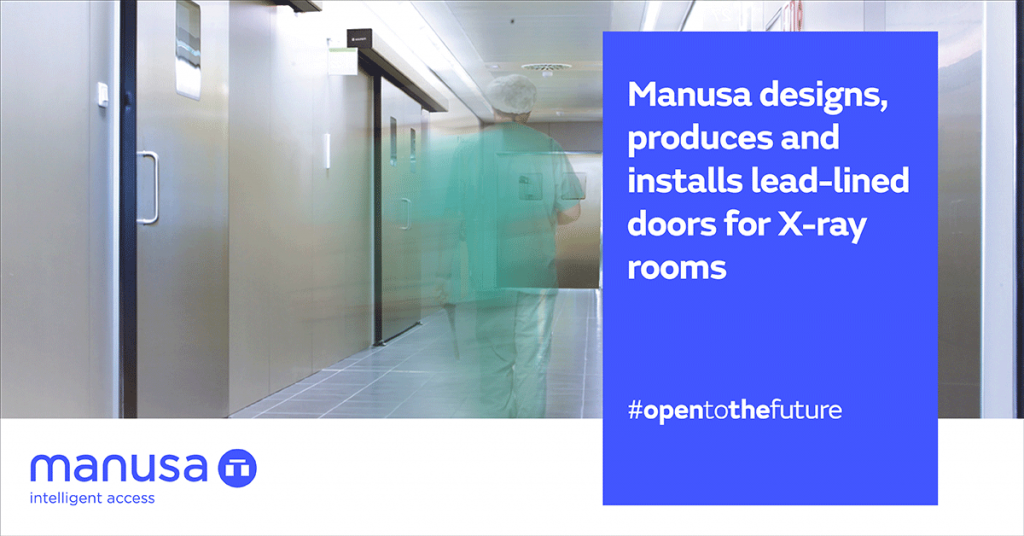
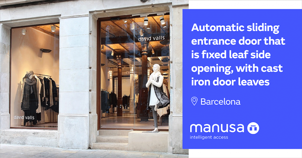
These types of images are used as resources to further enhance Manusa’s visual universe. We have our own photographs of products and projects. Contact marketing@manusa.com to request images.
General drawings
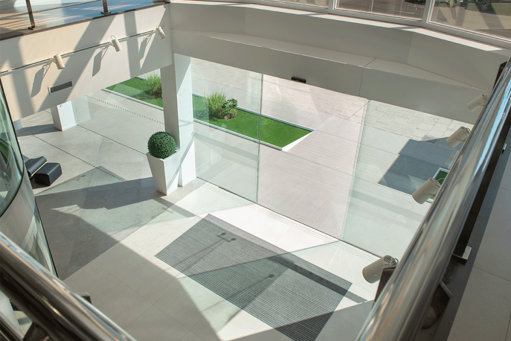
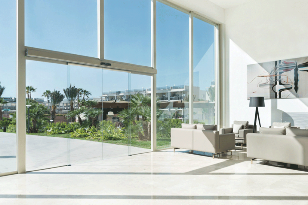
They should be well-lit, spacious and clear photographs, in which the absence of people is preferred so that the product is the main focus.
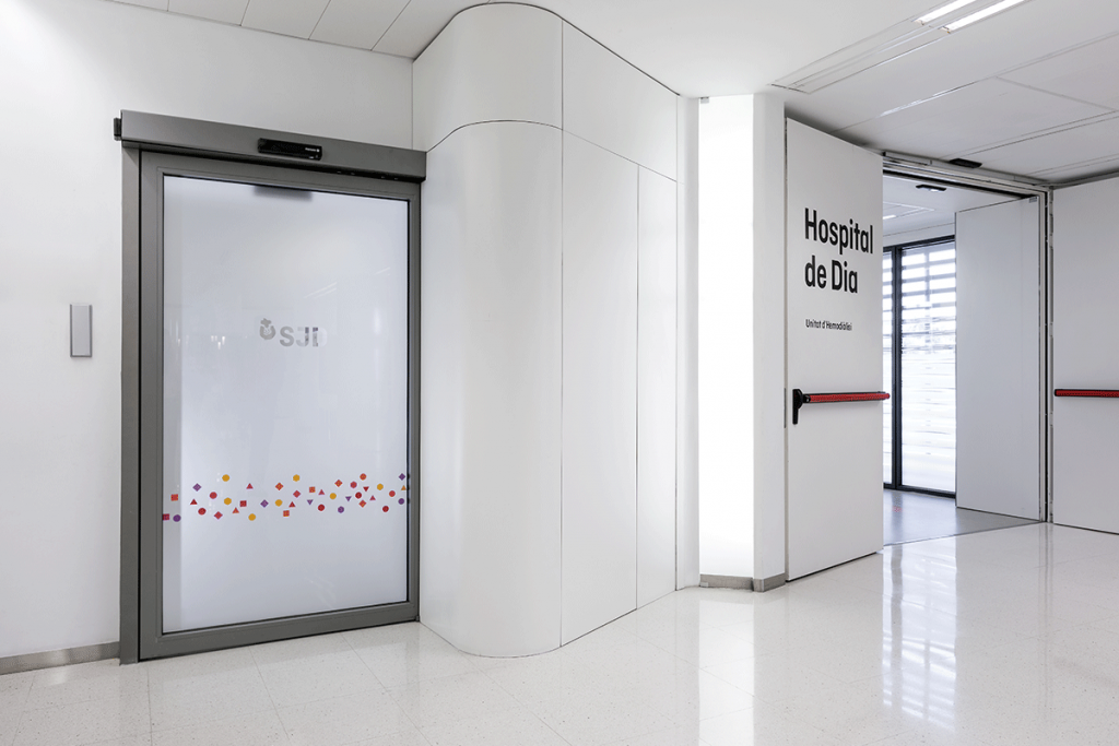
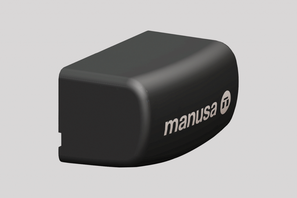
Product / detailed drawings
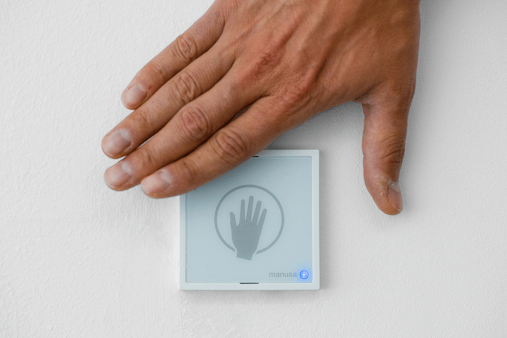
These must provide the details of the product to be shown in an artistic and elegant way. The brightness and contrast of the photographs are very important.
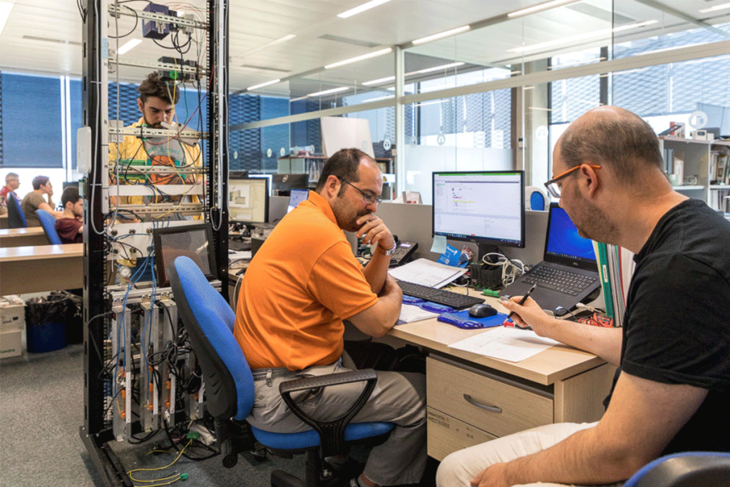
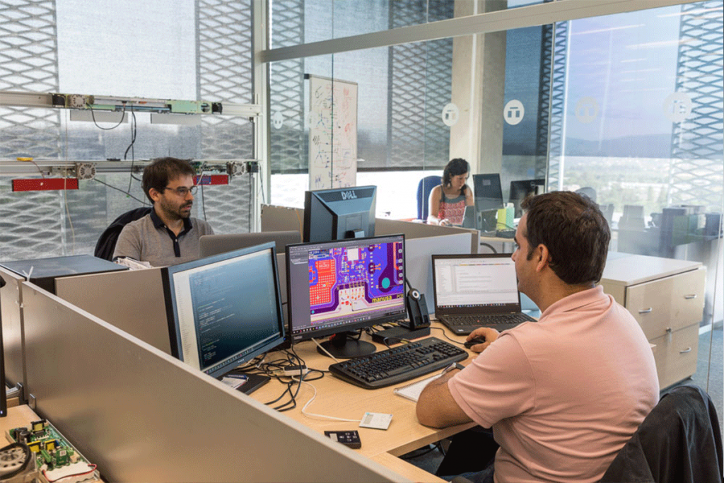
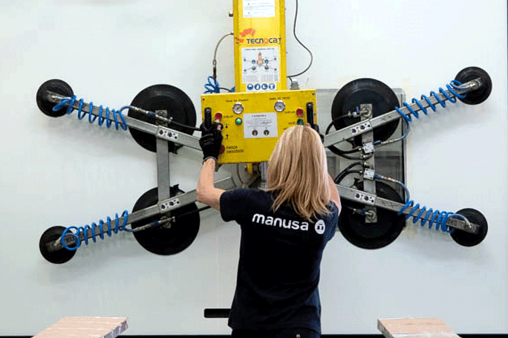
People
They must show people, customers or employees naturally, not looking at the camera. They must not look like studio photos. Generally, they should be warm images that convey transparency, proximity and honesty.
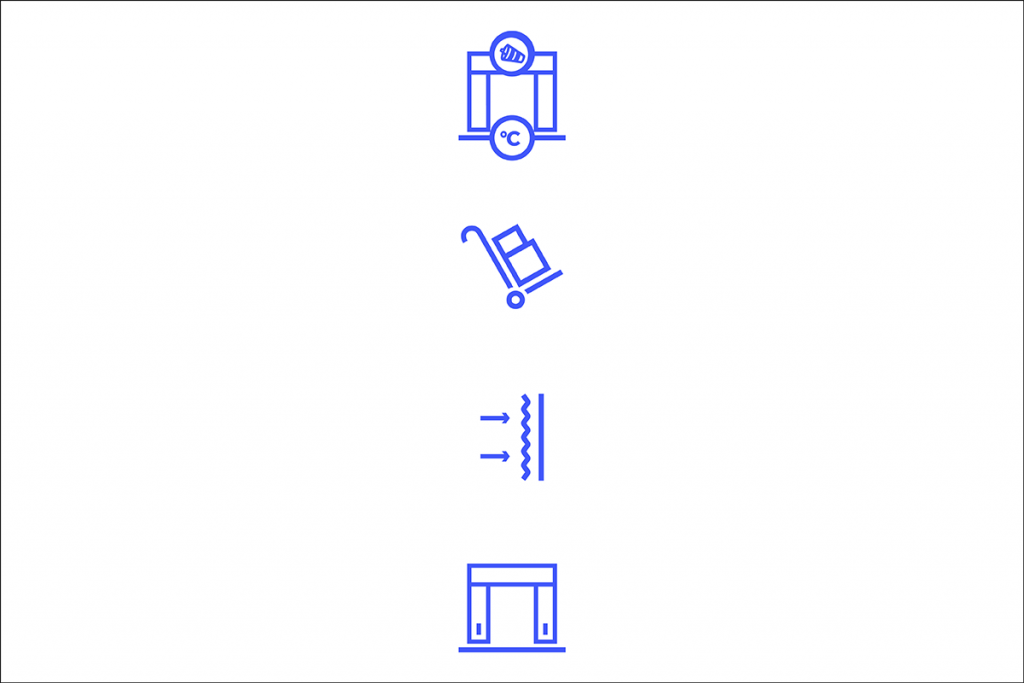
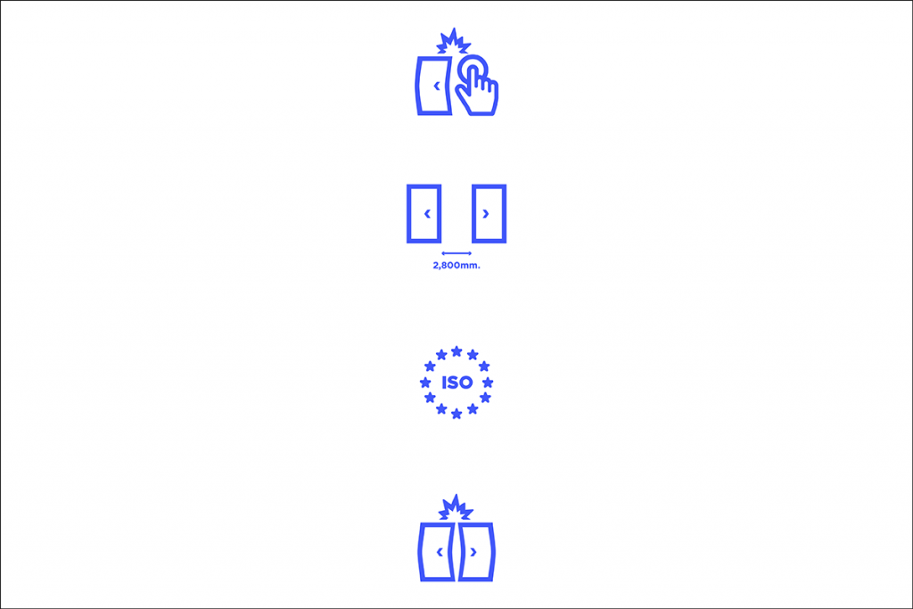
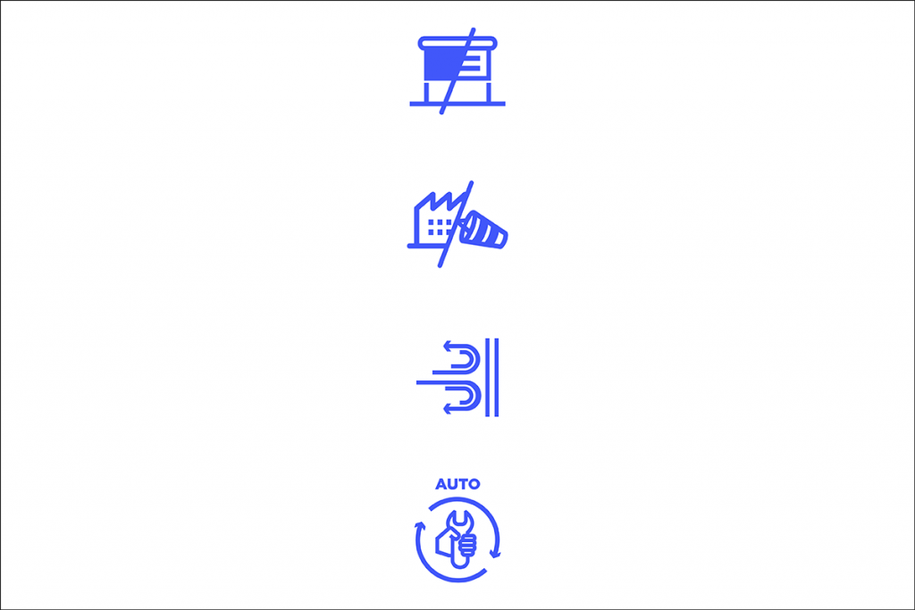
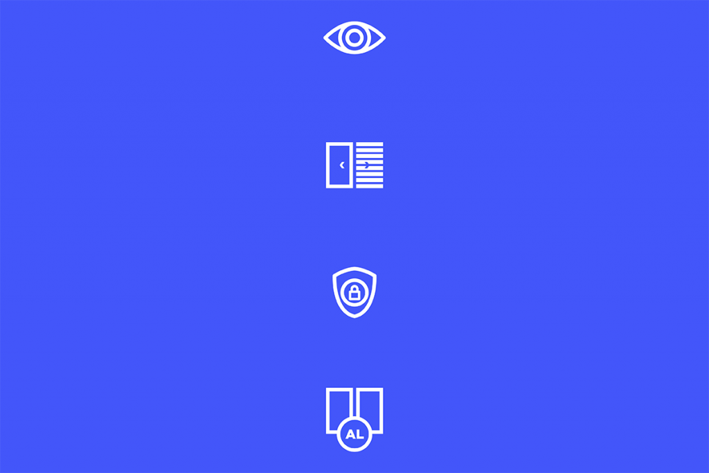
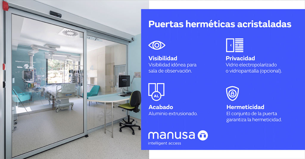
Icons
The icons are graphic resources used to complement different communication items, such as photos, videos, infographics or gifs. The use of pictograms helps our target audience easily identify the idea we want to express, enabling us to share a message with our recipients in a fast, effective manner.
They are organised into two groups: on one hand are those referring to the sectors in which Manusa is present and, on the other, those referring to the specific characteristics of each door or access.
Our design is based on a simple, clean, orderly and elegant composition system. One of the graphic elements used in Manusa’s visual language is the logo, of which we can use its different components.
The corporate colour and fonts will always be used in the design of Manusa’s graphic materials.